

Husqvarna, the world leader in robotic mowing
HUSQVARNA CONTINUES TO DRIVE INNOVATION IN LAWN CARE
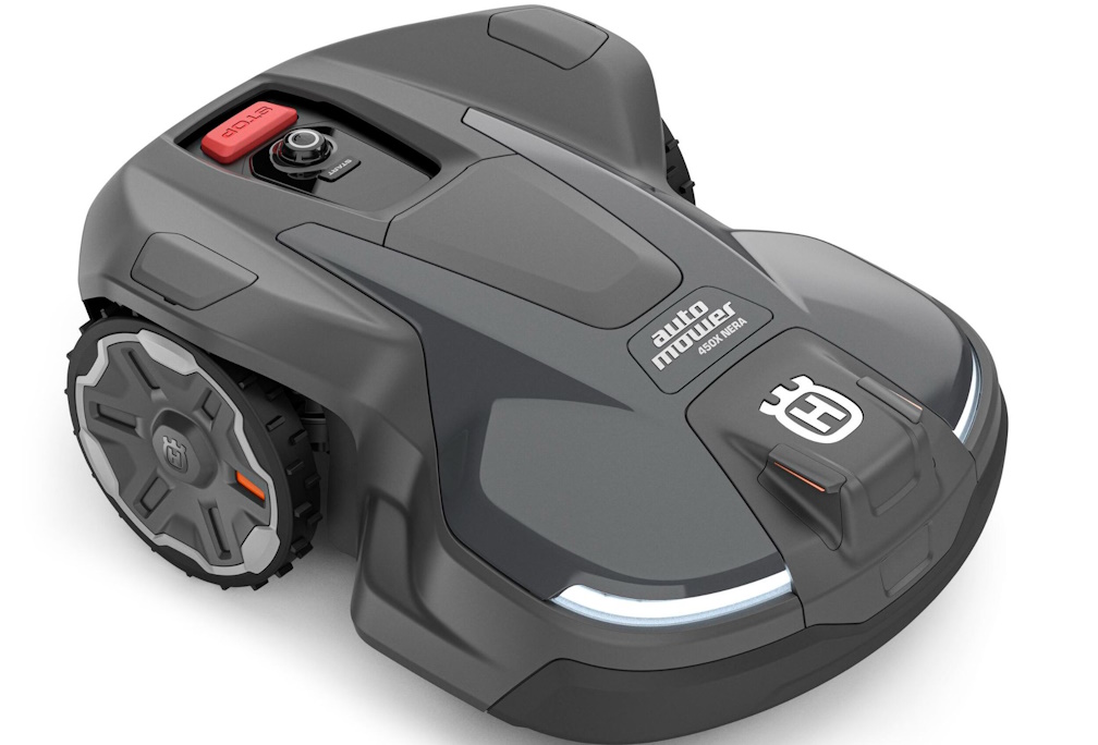
NEW ERA OF WIRE-FREE ROBOTIC MOWERS
Husqvarna, the world leader in robotic mowing*, continues to innovate as they launch a NEW ERA of boundary-wire free robotic lawn mowers for homeowners in Australia. The new range, named NERA, supports the Husqvarna EPOS satellite navigation system, a proven wire-free technology which enables the mower to work within virtual boundaries, providing total flexibility and ease. This allows the user to customise and create virtual cutting and stay out zones right from their smartphone, delivering an unparalleled user experience and precision results. The NERA range can also handle more complex terrains, steep slopes, and steers away from unwanted objects on the lawn.
More than 28 years ago, Husqvarna launched the world’s first robotic lawn mower and revolutionalised the lawn mowing category as it stood across the globe. With Husqvarna´s latest Automower® range, a new chapter of lawn care and smart garden technology begins. Husqvarna Automower® NERA uses Husqvarna EPOS (Exact Positioning Operating System) technology, a proven satellite navigation system, that has been used in the professional segment for more than two years.
“Australians have been waiting for the wire-free technology to reach our shores,” says Pauline Nilsson, Vice President at Husqvarna Australia. “With this next-generation intelligence, NERA will continue to make lawn mowing a breeze, and free up time to spend on things that matter most.”
NERA comes in three models, all of which support boundary wire-free technology. Husqvarna Automower® 430X NERA and 450X NERA can cut lawns of up to 3,200 m2 and 5,000 m2 respectively, while 320 NERA is optimal for lawns up to 2,200 m2.
"NERA harnesses innovation and the latest technology to catapult robotic mowers to the next level,” says technology commentator, Geoff Quattromani. “Integration into the smart home provides a completely personalised, wire free mowing experience. From the moment you bring it home you have a simpler, more flexible, way of installing and getting started on the path to the perfect lawn. The future of lawn care is here."
Handles complex lawns with precision: Husqvarna Automower® NERA with EPOS technology delivers centimetre level accuracy, operating with a precision of two to three centimetres and easily tackles the rough terrain, tight corners and slopes with up to 50% inclination of your property with precision and accuracy giving you the perfect lawn. All models come with improved terrain handling, which reduces the wear and tear of the lawn.
Object avoidance by radar: The 400 series come equipped with intelligent object avoidance through radar technology, to help the mower detect and avoid common objects like toys on the lawn, if the mower detects an object it will turn away to avoid impact, reducing the number of unwanted stops.
Flexibility with wire-free installation: Now with Husqvarna EPOS technology, it enables the mower to work with precision wire-free boundaries. Providing hassle free installation and allowing you to easily make updates to your landscape, customise your lawn and apply different settings, schedules and stay out zones with flexibility and ease.
Personalised zone control: Create work areas and temporary stay out zones in the Automower Connect App, without changing the installation. Giving you more control to define work areas, customise different schedules and cutting heights and allowing you to create virtual stay out zones with flexibility and ease.
Smart home integration: Conveniently control right from your smartphone with the Automower® Connect app and integrate with your smart home, enabling features like asking Google Home to mow your lawn or Amazon Alexa to park Automower® NERA.
An eco-smart choice: Battery-powered with low energy consumption, and no fuel or direct emissions to worry about, Husqvarna Automower® NERA is an eco-smart choice when it comes to lawn maintenance. And because they cut a small amount of grass on a continuous basis the clippings are recycled back into the lawn as a natural fertiliser resulting in a greener and fuller lawn without the need for synthetic fertilisers.
About Husqvarna Automower® NERA
Working area capacity: 2,200 m2 – 5,000 m2
Max slope performance: 50% 27 degrees
Accessories: EPOS Plug-in module for Wire-free operation
Connectivity: 4G, Wi-Fi, Bluetooth (400-Series) or Wi-Fi, Bluetooth (320)
Cutting height: 2-6 cm
Recommended Retail Price
Husqvarna Automower® 320 NERA $3,999
Husqvarna Automower® 430X NERA $4,899
Husqvarna Automower® 450X NERA $6,399
EPOS plug-in kit, including reference station sold separately $1,999
To view the Husqvarna Nera in action view: here and here
For more product information visit: Husqvarna